


Design Rationale
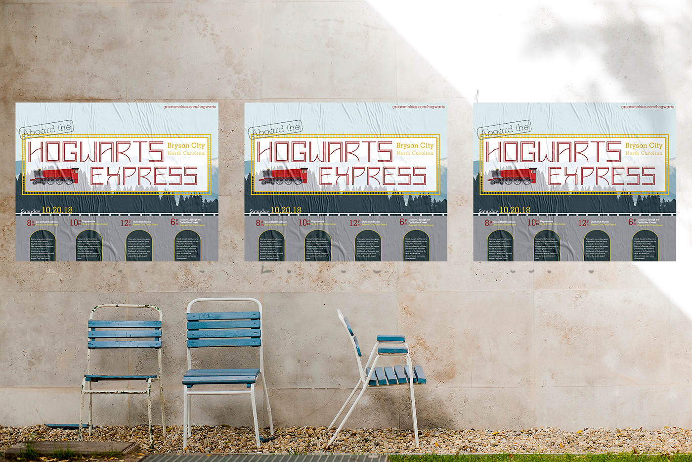
The purpose of this project was to utilize the typeface created in Project 1 and incorporate it into a type-driven poster. For this poster, an event was created that would take place in Bryson City, North Carolina. Since the typeface, “Derailed”, was created using railroad tracks, the event is train related. The event, “Aboard the Hogwarts Express” is Harry Potter themed and utilizes the Hogwarts Express train as a focal point. The event takes place on Saturday, October 20th and hosts several Harry Potter related events throughout the day. These events include an English-style breakfast at a restaurant near the Bryson City Train Depot, as well as a lineup of vendors and a quidditch game outside the Train Depot. The day would finish off with a train ride on the Great Smokey Mountain Railroad. Guests would be treated to hot chocolate and ghost stories as the train takes them through the woods.
The colors used are a dark red and gold to correlate with the train vector, and darker blues to correlate with the mountain-forest background. “Hogwarts Express” is typed with the typeface “Derailed” and then enclosed in a box made of those track elements. This helps to establish the hierarchy of the title and keep the poster focused on the typeface. “Aboard the” and the remaining headlines and body copy are written with the font Memphis LT Std. “Aboard the” is designed to look like a travel stamp and to add to the train travel feel of the poster. Memphis LT Std was chosen because of its quirky yet structured feel. It related well to the poster’s theme, Harry Potter, which focuses around wizardry and a mythical place, yet it also involves trains and the structure that comes with railroad tracks. The text colors alternate between white, gold, and red, helping to create hierarchy. The copy for the four events during the day are enclosed in the arches of the railroad track bridge which the event day sits on. This allows for organization of the events according to their time. The time, individual event name, and location are placed above the correlating arches, helping to create text hierarchy. Red is used for the time, white for the event name, and yellow for the location. This helps to distinguish the text from one another and improve readability.
This design solution works best for the project because it is focused on the “Derailed” font and is type driven. The colors, red, yellow, and white, as well as text arrangement, allow for good text hierarchy and smooth readability. The color palette utilizes the warmer colors of the Hogwarts Express train and the cooler colors from the mountain-forest background creating a color balance in the poster.


